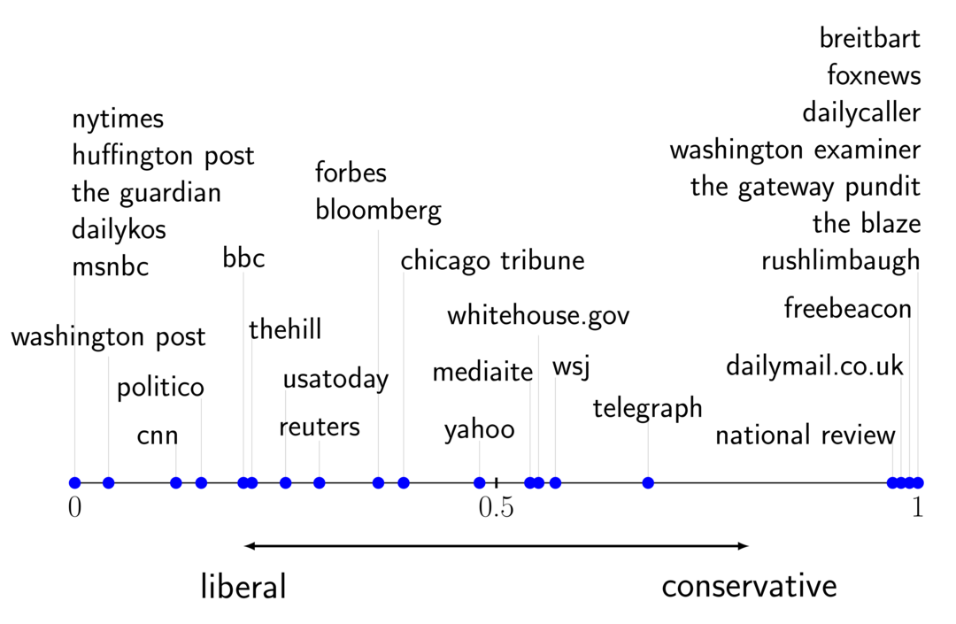
In this demo we have developed exploratory and interactive interfaces that can help Twitter users explore their information filter bubble. The experience focuses on visualizing the ideological positioning of a user and the ideological positioning of the content consumed by her. There is a link between a user and a media source, if the user has interacted with the said media source. Size of a data point depicts the volume of interaction between user and the corresponding media source.
Click on the interactive visualization below to explore the user-content ideological latent space on Twitter. For the ease of exploration we have filtered the graph to visualize some well known Twitter users and approximately 500 popular news media channels. Hover over the points to see the point labels. Use the toolbar buttons at the bottom-left of the plot to enable zooming and panning, and to reset the view.
Click on a twitter account below to explore to the user's information filter bubble. Hover over the points to see the point labels. Use the toolbar buttons at the bottom-left of the plot to enable zooming and panning, and to reset the view..
This demo is built using the mpld3, an interactive D3 js based viewer for matplotlib.